
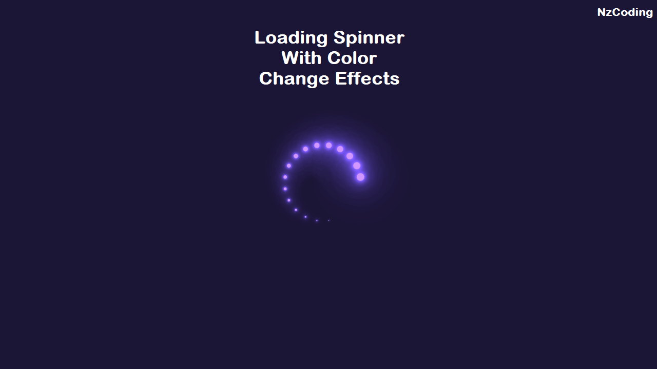
Loading Spinner with Html & Css
HTML CSS
SPINNER
Video Tutorial:
Html Code:
<!DOCTYPE html><html lang="en"><head><meta charset="UTF-8"><meta http-equiv="X-UA-Compatible" content="IE=edge"><meta name="viewport" content="width=device-width, initial-scale=1.0"><link rel="icon" type="image/x-icon" href="assets/images/favicon.png"><title>NzCoding - CSS Loading Spinner</title><link rel="stylesheet" href="assets/css/style.css" /></head><body><div class="container"><div class="content"><div class="item"></div><div class="item"></div><div class="item"></div><div class="item"></div><div class="item"></div><div class="item"></div><div class="item"></div><div class="item"></div></div></div></body></html>
Css Code:
body{background: #17253f;}.container{position: fixed;top: 50%;left: 50%;height: 2rem;width: 2rem;transform: translateX(-50%) translateY(-50%);}.content{position: absolute;top: 0;left: 0;height: 2rem;width: 2rem;}.content > .item{position: absolute;height: 2rem;width: 2rem;background: white;-webkit-animation: move 2s linear infinite;animation: move 2s linear infinite;}.content > .item:nth-of-type(1) {top: -2rem;left: -2rem;-webkit-animation-delay: -1.75s;animation-delay: -1.75s;}.content > .item:nth-of-type(2) {top: -2rem;left: 0;-webkit-animation-delay: -1.5s;animation-delay: -1.5s;}.content > .item:nth-of-type(3) {top: -2rem;left: 2rem;-webkit-animation-delay: -1.25s;animation-delay: -1.25s;}.content > .item:nth-of-type(4) {top: 0;left: 2rem;-webkit-animation-delay: -1s;animation-delay: -1s;}.content > .item:nth-of-type(5) {top: 2rem;left: 2rem;-webkit-animation-delay: -0.75s;animation-delay: -0.75s;}.content > .item:nth-of-type(6) {top: 2rem;left: 0;-webkit-animation-delay: -0.5s;animation-delay: -0.5s;}.content > .item:nth-of-type(7) {top: 2rem;left: -2rem;-webkit-animation-delay: -0.25s;animation-delay: -0.25s;}.content > .item:nth-of-type(8) {top: 0;left: -2rem;-webkit-animation-delay: 0;animation-delay: 0;}@-webkit-keyframes move {0% {transform: rotate(0) scale(1);-webkit-animation-timing-function: ease-in;animation-timing-function: ease-in;}10% {transform: rotate(90deg) scale(0);}50% {transform: rotate(90deg) scale(0);-webkit-animation-timing-function: ease-out;animation-timing-function: ease-out;}60% {transform: rotate(180deg) scale(1);}100% {transform: rotate(180deg) scale(1);}}@keyframes move {0% {transform: rotate(0) scale(1);-webkit-animation-timing-function: ease-in;animation-timing-function: ease-in;}10% {transform: rotate(90deg) scale(0);}50% {transform: rotate(90deg) scale(0);-webkit-animation-timing-function: ease-out;animation-timing-function: ease-out;}60% {transform: rotate(180deg) scale(1);}100% {transform: rotate(180deg) scale(1);}}
I hope it can help you....

Comments (0)
Leave a Comment
You need to login to post a comment
Login to Comment