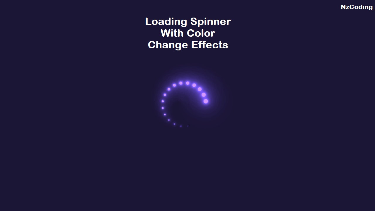
Html Loading Spinner with Color Changing Effects
HTML CSS
SPINNER
Video Tutorial:
Html Code:
<!DOCTYPE html><html lang="en"><head><meta charset="UTF-8"><meta http-equiv="X-UA-Compatible" content="IE=edge"><meta name="viewport" content="width=device-width, initial-scale=1.0"><link rel="icon" type="image/x-icon" href="assets/images/favicon.png"><title>NzCoding - CSS Loading Spinner</title><link rel="stylesheet" href="assets/css/style.css" /></head><body><section><div class="loader"><span style="--i:1;"></span><span style="--i:2;"></span><span style="--i:3;"></span><span style="--i:4;"></span><span style="--i:5;"></span><span style="--i:6;"></span><span style="--i:7;"></span><span style="--i:8;"></span><span style="--i:9;"></span><span style="--i:10;"></span><span style="--i:11;"></span><span style="--i:12;"></span><span style="--i:13;"></span><span style="--i:14;"></span><span style="--i:15;"></span><span style="--i:16;"></span><span style="--i:17;"></span><span style="--i:18;"></span><span style="--i:19;"></span><span style="--i:20;"></span></div></section></body></html>
Css Code:
* {margin: 0;padding: 0;box-sizing: border-box;}section {display: flex;justify-content: center;align-items: center;min-height: 100vh;background: #042104;animation: animateBg 10s linear infinite;}@keyframes animateBg {0% {filter: hue-rotate(0deg);}100% {filter: hue-rotate(160deg);}}section .loader {position: relative;width: 120px;height: 120px;}section .loader span{position: absolute;top: 0;left: 0;width: 100%;height: 100%;transform: rotate(calc(18deg * var(--i)));}section .loader span::before {content: '';position: absolute;top: 0;left: 0;width: 15px;height: 15px;border-radius: 50px;background: #00ff0a;box-shadow: 0 0 10px #00ff0a,0 0 20px #00ff0a,0 0 40px #00ff0a,0 0 60px #00ff0a,0 0 80px #00ff0a,0 0 100px #00ff0a;animation: animate 2s linear infinite;animation-delay: calc(0.1s * var(--i));}@keyframes animate {0% {transform: scale(1);}80%, 100% {transform: scale(0);}}
Thanks for reading
Hope it will help you


Comments (0)
Leave a Comment
You need to login to post a comment
Login to Comment