3D Card Design With Hover Animation with Html Css
Hello friends, today in this blog you’ll learn how to create a 3D Card with Hover Animation using only HTML & CSS.
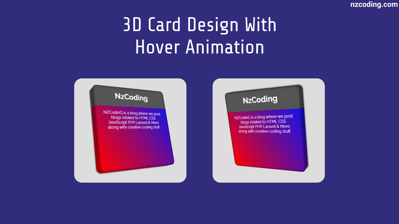
In our design [Pure CSS 3D Card], there is a single card as you can see in the preview image above. When you will hover on the card it will animate and turn to the left site and on hover out it will get back to its previous position.
If you are confusing about how this card works or how it is created using only HTML & CSS then you can watch a video tutorial of this 3D Card with Hover Animation.
Video Tutorial of 3D Card with Hover Animation
Animated Pricing Card Design [Source Codes]
To create this design [CSS 3D Card Design]. First, you need to create two Files one HTML File and another one is CSS File. After creating these files just paste the following codes into your file. You can also download the source code files of this Pricing Card from the given download button and also can find the code in github.
First, create an HTML file with the name of index.html and paste the given codes in your HTML file. Remember, you’ve to create a file with .html extension.
index.html
<!DOCTYPE html><html lang="en"><head><meta charset="UTF-8"><meta http-equiv="X-UA-Compatible" content="IE=edge"><meta name="viewport" content="width=device-width, initial-scale=1.0"><link rel="icon" type="image/x-icon" href="assets/images/favicon.png"><title>NzCoding - 3D Card Design with Hover Animation</title><link rel="stylesheet" href="assets/css/style.css" /></head><body><div class="card-container"><div class="card"><h1><strong>NzCoding</strong></h1><p>NZCodinG is a blog where we post blogs related to HTML CSS JavaScript PHP Laravel & More along with creative coding stuff.</p><div class="layers"><div class="layer"></div><div class="layer"></div><div class="layer"></div><div class="layer"></div><div class="layer"></div><div class="layer"></div><div class="layer"></div><div class="layer"></div><div class="layer"></div><div class="layer"></div></div></div></div></body></html>
Second, create a CSS file with the name of style.css and paste the given codes in your CSS file. Remember, you’ve to create a file with .css extension.
style.css
@import url("https://fonts.googleapis.com/css?family=Raleway:400,400i,700");* {margin: 0 auto;padding: 0;box-sizing: border-box;}body {font-family: Raleway, sans-serif;display: flex;align-items: center;min-height: 100vh;background-color: #ddd;}.card-container {perspective: 50em;}.card-container {--bi: linear-gradient(#555 5em, #0000 3em), linear-gradient(60deg, #ff0000, #0015ff);}.card {position: relative;width: 320px;height: 320px;text-align: center;padding: 1.2em 2em;color: #fff;transform: rotateY(30deg) rotateX(15deg);transform-style: preserve-3d;transition: transform 1s;}.card p {padding-top: 2.5em;}.card:hover {transform: rotateY(-30deg) rotateX(-15deg);}.layers {position: absolute;left: 0;top: 0;width: 100%;height: 100%;transform-style: preserve-3d;z-index: -1;}.layer {position: absolute;left: 0;top: 0;width: 100%;height: 100%;border-radius: 1em;background-image: var(--bi);transform: translateZ(var(--tz));box-shadow: 0 0 0.5em #000d inset;}.layer:nth-child(1) {--tz: 0px;}.layer:nth-child(2) {--tz: -4px;}.layer:nth-child(3) {--tz: -8px;}.layer:nth-child(4) {--tz: -12px;}.layer:nth-child(5) {--tz: -16px;}.layer:nth-child(6) {--tz: -20px;}.layer:nth-child(7) {--tz: -24px;}.layer:nth-child(8) {--tz: -28px;}.layer:nth-child(9) {--tz: -32px;}.layer:nth-child(10) {--tz: -36px;}.layer:last-child {box-shadow: 0 0 0.5em #000d inset, 0 0 5px #000;}
That’s all, now you’ve successfully created a Pure CSS 3D Card Design. If you’ve faced any kind of problem of running this code then please download the source code from the given download button. After clicking download button a .zip file will be downloaded. Then you’ve to extract it or you can download the code from github by clicking the bellow github link.


Comments (0)
Leave a Comment
You need to login to post a comment
Login to Comment